Warm Contemporary Office Reception Design: Creating a Calm First Office Impression
A reception area is more than a point where visitors wait. It is the first spatial experience associated with a business, and it can influence how people understand the organisation before a conversation begins. The design therefore has to balance several requirements: it should be welcoming, easy to understand, visually memorable and practical for everyday use.
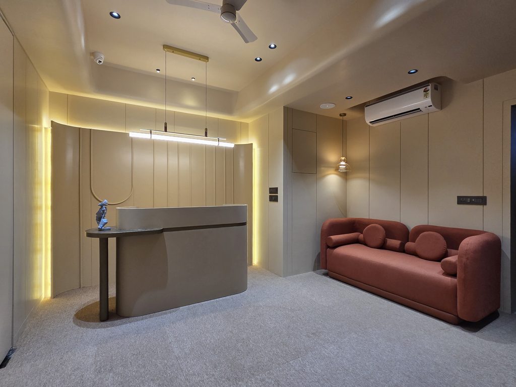
The supplied image shows a contemporary reception or entry setting built around a curved desk, a warm neutral palette and a separate upholstered seating zone. The visible composition is calm and refined rather than heavily decorated. Soft curves, vertical wall detailing, concealed lighting and a muted terracotta sofa give the interior a clear identity while keeping the overall atmosphere approachable.
This type of reception design demonstrates how a commercial interior can create impact through proportion, light, colour and detail instead of relying on excessive ornamentation.
1. Begin with the visitor’s arrival experience
The first few seconds in a reception area matter. Visitors should be able to understand where to approach, where to sit and how to move through the space without visual confusion. A well-defined reception desk acts as an orientation point, while a nearby seating area gives visitors a clear place to pause.
In the image, the desk occupies the foreground and centre of the composition, making it the principal arrival element. The sofa sits to the right, visually connected to the reception zone but separated enough to retain its own identity. This creates a simple spatial hierarchy: arrival, assistance and waiting can be understood at a glance.
When planning a reception interior, the design should consider the route from the entrance to the desk, the relationship between the desk and seating, and the amount of open space needed for comfortable movement. These planning decisions should be resolved before decorative elements are finalised.
2. Make the reception desk a strong but balanced focal point
The curved reception desk is the most prominent object in the foreground. Its rounded front gives the room a softer character than a conventional rectangular counter would. The light taupe or grey body keeps the desk visually integrated with the wall and floor, while the darker top creates a controlled contrast.
A successful reception counter should be visible without feeling oversized. Its scale, height and depth need to support the staff member’s work while leaving enough room for visitors to approach comfortably. Storage, equipment, power, lighting and cable management also need to be planned within the counter design, even when they are not visible in the finished photograph.
The curved profile is particularly effective because it reduces the sense of a hard barrier between the visitor and the reception team. It introduces a more open and welcoming visual language while maintaining a clear point of service.
3. Repeat curves to create visual continuity
Curved forms appear in several visible elements: the reception counter, the rounded-rectangular wall feature and the arms of the sofa. Repeating a shape across different scales creates a connection between the furniture and architecture. The curves do not appear isolated; they form a consistent design vocabulary.
This is a useful principle for contemporary interior design. One curved element can look decorative or accidental, but a carefully repeated curve can help the entire room feel intentional. The shape may be repeated in a wall niche, reception desk, seating piece, lighting detail, joinery edge or accessory.
The space also demonstrates the importance of contrast. The vertical wall divisions, straight ceiling lines and linear pendant introduce structure against the rounded elements. This balance prevents the room from becoming visually soft or undefined.
4. Create depth with warm neutral finishes
The base palette is composed of warm beige, cream, taupe and grey. These colours give the reception area a calm foundation and allow the architectural details to remain visible without becoming visually aggressive. Neutral colours are especially useful in commercial interiors because they can support a wide range of branding, furniture and lighting decisions.
A neutral palette does not need to be flat. Depth can be created through changes in tone, sheen, pattern and texture. In this setting, the wall treatment appears more detailed than the smooth desk body, while the floor introduces a grey textured layer. The sofa then provides a warmer colour accent.
The muted terracotta or coral upholstery is an effective choice because it adds personality without breaking the calm composition. A similar approach can be used in other reception areas: maintain a quiet architectural base and introduce one or two considered accents through seating, artwork, accessories or brand colours.
The exact materials in the photograph should be confirmed before publication. The visible image alone does not establish whether the wall panels are timber, laminate, painted board, fabric or another finish.
5. Use accent colour strategically
Colour has a direct effect on how a visitor reads a space. A completely neutral reception may feel elegant but can lack memorability. Too many strong colours can make the area feel busy and reduce the clarity of the brand experience.
The sofa in this image acts as the principal accent. Its terracotta tone draws attention toward the seating zone and adds warmth to the beige and grey surroundings. Because the colour is muted rather than highly saturated, it supports the sophisticated character of the interior.
When choosing an accent colour, designers should consider the brand identity, the amount of natural light, the colour of adjacent finishes and how the space will appear in photographs. Upholstery is often a practical place to introduce colour because it can be updated more easily than a fixed architectural surface.
6. Layer lighting instead of depending on one source
Lighting is one of the strongest features of the visible composition. The space appears to combine warm concealed lighting around the wall detailing, recessed ceiling spotlights, a linear pendant over the desk and a smaller pendant near the sofa.
Each source can serve a different role:
- Ambient lighting establishes the overall level of illumination.
- Task lighting supports reception work and improves visibility at the desk.
- Accent lighting emphasises the wall treatment and architectural geometry.
- Decorative lighting helps define the seating area and contributes to the mood.
The warm concealed light gives the wall a soft amber glow, while the linear pendant provides a brighter, more functional contrast. This combination prevents the reception area from appearing either too flat or too dramatic.
Lighting design should also account for glare, shadows, colour rendering, maintenance access and the position of screens or reflective surfaces. The final lighting plan should be coordinated with the ceiling, electrical layout and technical requirements rather than added as an afterthought.
7. Give the seating area its own identity
The terracotta sofa creates a comfortable-looking pause point beside the reception desk. Its rounded arms and cushions echo the curved forms elsewhere in the room, while its deeper colour makes it easy to identify as a separate seating zone.
Reception seating should be welcoming but should not obstruct the main circulation route. The sofa should be positioned so that visitors can sit comfortably while remaining aware of the reception desk. Where space allows, side tables, charging points, reading material or a small display can make the waiting experience more practical.
The image also shows that seating does not need to be treated as an isolated furniture decision. It can contribute to the room’s colour story, repeat its formal language and strengthen the overall visual hierarchy.
8. Make feature walls work harder
The wall behind the reception desk functions as the visual backdrop of the room. Repeated vertical divisions create rhythm, while the larger rounded-rectangular feature gives the wall a central focus. Concealed lighting appears to follow parts of the wall treatment, bringing attention to its geometry.
A feature wall is most effective when it supports the architecture rather than simply filling an empty surface. Its scale should relate to the desk, ceiling height and visitor sightline. Vertical detailing can visually emphasise height, while a framed or recessed central element can help anchor the reception counter.
Feature walls also require practical coordination. Panels need appropriate fixing, access to services may be necessary, and lighting channels should be detailed before installation. The visible result should be supported by accurate drawings and careful execution.
9. Coordinate practical services discreetly
The image includes visible building services such as a split air-conditioning unit, switches and control points. These elements are necessary, but they need to be coordinated with the visual composition so they do not compete with the focal wall or reception desk.
Commercial interior design is successful when technical requirements are considered early. Air-conditioning, electrical points, data connections, lighting controls, fire-safety requirements and maintenance access all influence the layout. Concealing every service is not always possible or necessary; the goal is to integrate them honestly and neatly.
The reception desk must also accommodate real operational needs, including equipment, storage, visitor communication and staff comfort. These details may be hidden in the final image, but they are essential to the performance of the space.
10. Balance visual softness with workplace functionality
The interior has a soft visual language, but it still needs to function as a working reception environment. The desk provides a defined service point, the pendant gives focused illumination, and the seating zone provides a place for visitors to wait. The floor and wall finishes also need to be selected with cleaning, wear and long-term maintenance in mind.
Functionality should not be treated as separate from design. It should shape the design from the beginning. The best reception interiors make practical decisions feel intentional: storage becomes part of the desk, lighting becomes part of the architecture, and circulation becomes part of the visual composition.
Before execution, designers should confirm dimensions, access requirements, accessibility, furniture clearances, lighting levels, material samples and service coordination. These checks protect both the appearance and the usability of the finished interior.
11. Create a brand experience through restraint
A reception area does not need to display every aspect of a company’s identity at once. A stronger result often comes from selecting a few consistent signals: a controlled palette, a distinctive form, a recognisable material language and a carefully considered light environment.
In this space, the curved counter, warm neutral surfaces and terracotta seating create a memorable identity without visible visual clutter. The reception environment feels composed because the design decisions appear to support one another.
For a business, this restraint can be valuable. It allows the visitor to focus on the organisation and the service experience rather than on an overcrowded decorative display. Branding can be introduced through a logo, signage, artwork or selected colour accents once the architectural base is resolved.
12. A design process from idea to execution
A considered commercial interior begins with understanding the client’s requirements, the site conditions and the intended experience. At Prisca Design, the process is expressed through three stages: Ideation, Conceptualization and Execution.
Ideation establishes the direction of the space: how visitors should feel, how the area should function and what design language is appropriate. Conceptualization develops that direction through planning, materials, lighting, furniture, finishes and visual references. Execution then translates the approved design into a coordinated, buildable interior.
For a reception area, this process helps connect the first impression with the practical needs of the business. It also gives the design team an opportunity to review proportions, circulation, services and detailing before work begins on site.
Reception interior design checklist
Before finalising a reception area, consider the following questions:
- Can a first-time visitor immediately identify the reception desk?
- Is the route from the entrance to the desk clear and comfortable?
- Is the waiting area connected to the desk without obstructing circulation?
- Does the colour palette support the company’s identity?
- Are curves, lines and feature details repeated with purpose?
- Does the lighting provide ambient, task and accent illumination?
- Are screens, reflective surfaces and seating protected from glare?
- Have electrical, data, air-conditioning and maintenance requirements been coordinated?
- Are the finishes suitable for cleaning and everyday commercial use?
- Have accessibility and ergonomic requirements been reviewed?
- Are the project name, location, materials and completion status confirmed before publishing photographs?
Frequently asked questions
What makes a reception area feel welcoming?
A welcoming reception area usually combines clear orientation, comfortable seating, appropriate lighting, balanced proportions and a visual palette that feels approachable. The visitor should understand where to go without feeling rushed or overwhelmed.
Why are curved reception desks popular?
Curved desks can soften the appearance of a reception area and reduce the visual severity of a straight barrier. They can also help create a more fluid relationship between the desk, visitor approach and surrounding circulation. Their dimensions and ergonomics still need to be carefully planned.
How can a neutral reception interior avoid looking dull?
Introduce variation through tone, texture, lighting, wall detailing, furniture shape and one or two controlled accent colours. Neutral design becomes richer when the surfaces are layered rather than all treated identically.
How many types of lighting should a reception area have?
There is no fixed number. A practical scheme usually considers general illumination, task lighting at the reception desk and accent or decorative lighting for architectural features and seating. The final arrangement depends on the space, ceiling, daylight and technical requirements.
How can a commercial reception area reflect a brand?
Brand identity can be expressed through colour, material, geometry, signage, artwork, lighting and the quality of detailing. A restrained approach is often more effective than placing logos or strong colours everywhere.
Final thought
A reception area can create a lasting first impression without relying on excessive ornamentation. In the supplied image, the visual impact comes from a clear hierarchy: the curved desk establishes the arrival point, the warm wall treatment creates depth, the layered lighting shapes the atmosphere, and the terracotta sofa adds a memorable accent.
Together, these elements show how contemporary reception interior design can be calm, functional and distinctive at the same time. The most successful result will come from combining the visual concept with careful planning, technical coordination and execution suited to the actual requirements of the business.
If you are planning a commercial interior in Ahmedabad, speak with Prisca Design about developing a reception and workplace environment that reflects your requirements and identity.
Call: +91-9825147727
Email: prisca88design@gmail.com
Website: https://priscadesign.com